Creating visual aspects of your presentation is one of the most important thing and it help people understand you more. But are you tired using boring slide templates? Here are few tips:
Fonts
One of the biggest mistakes is mixing two vastly different fonts. To avoid that, you can either use only one font for everything or you have these options:
-
Use sans-serif for headers and serif for text. But if your presentation doesn’t have much text, I recommend to avoid serif fonts completely.
Use two different sans-serif fonts. Be aware whether they fit together.
Avoid using two different serif fonts. All serif fonts are very similar and that may be confusing for readers. However, serif fonts are more comfortable for our eyes to read, so as I mentioned, you can use them but only for text.
- Avoid using boring fonts. Use these instead:

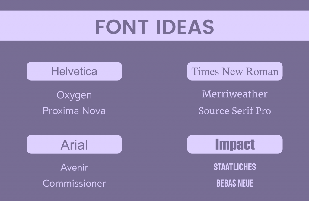
Helvetica -> Proxima Nova*, Oxygen
Arial -> Commissioner, Avenir*
Impact-> Staatliches, Bebas Neue
Times new Roman -> Source Serif Pro, Merriweather
And remember the most important thing. Never EVER use COMIC SANS. This font is so insidious that it instantly evokes anger to everyone. But I suppose you already know.
* Can’t be used for commercial purposes
Colours
There are millions of colours to use and finding the best combination can be often frustrating. Here are my suggestions:
- Inspire by googling colour palettes. Choose these combinations, which caught your attention. Also, a lot of beautiful colour combinations can be found on Pinterest.
- Black and white are universal colours and you can combine them with every single colour.
- Don’t use gradient backgrounds. They are harder to combine with other objects and blurred colours may make your slides look outdated.
Pictures and copyright claims
If you want to avoid copyright, use your own images. But that’s not always possible and there are lots of pictures on the internet.
Here are best resources for images and icons:
- If you are using pictures from the internet for personal or school purposes, it’s enough to put a link to give a credit.

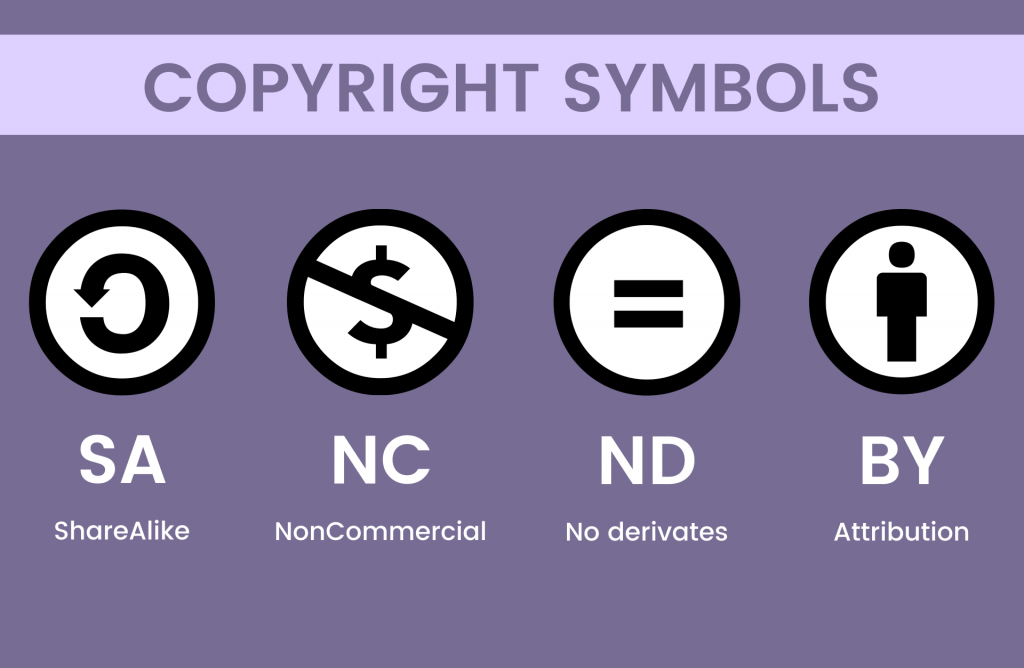
If for commercial purposes, be aware about copyright claims. The most used license is Creative Commons, which is simple to understand, but if you are unsure ask the author.
Avoid using low quality images. As a background, find at least Full HD (1920×1080) resolution.
If you want to crop the image, just click (or left-click) on it two times.
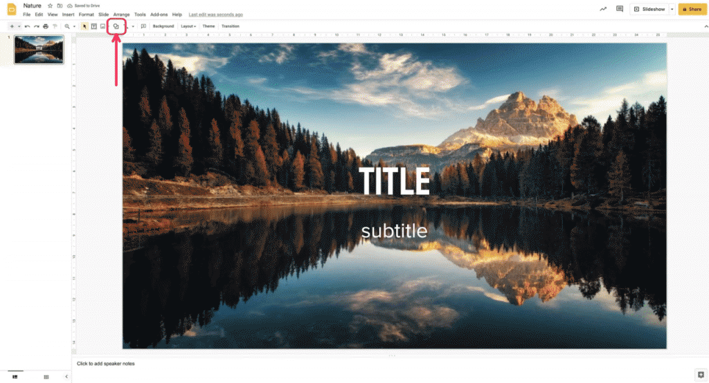
You can use a picture as a background. However, with text you need to darken the image, so the text will be readable. Here are the steps (Google slides):

- Click on “shapes” icon
- Add a rectangle and cover the whole screen
- Click on “colours” and create a custom colour
- Insert the code: 00000045 or drag the circle to the bottom right and set transparency to less than half.
- FInd “Arrange” (on the top), then select “Order” and click two times on “Send backwards”
All done! (It should work similarly on PowerPoint).
Templates
Don’t you want to start with blank slide? You can also try to use a template. There are many resources which provide them and I personally like Slidesgo the most. Most of the templates are for free and they are available for Microsoft PowerPoint and Google Slides.
In conclusion, the simpler the better. A lot of text can be replaced with one image. That’s up to you.

